Howdy, folks, it’s your least humble servant here again with an apology for not blogging sooner. In short, I went and repeated the same error as last year: that of letting December happen after a successful NaNoWriMo. In doing so I caught a bad dose of January too.
Writing has gone unwritten. Books read have gone unreviewed. Books unread continue to breed with gay abandon when I’m not looking. Then, of course, there’s The Day Job. (Wields crucifix-fingers.) Sadly my Christmas wish for 48-hour days (or a big lottery win) never came true.
Progress on The Forum of the Dead has stalled as a result, and will likely need a reboot, which is disappointing but, weirdly, kind of appealing at the same time. To console myself I’m writing a much more simple (and shorter) ghost story, which is keeping me amused on these wet, blustery nights.
For this post, however, I’ll wrap up a few remaining thoughts from when I published The Floors last year. I’ll keep them brief(ish), but these are the things I’ll keep in mind for future projects.
Promotion
In a previous post I outlined the costs incurred in advertising The Floors, which had come to a pretty penny. Indeed, once the editing costs were factored in I was looking at a break-even figure akin to those targeted by small presses. “Tall order” didn’t cover the half of it!
So, nearly five months later, have I made back the cost? Good lord, no, but then that was pretty much to be expected. I’m an unknown quantity in a crowded, noisy marketplace, after all. On top of that The Floors is self-published, which nowadays is enough to see a significant number of readers running for cover from the shit-volcano’s pyroclastic cloud.
Okay, so did I attract any readers? Indeed I did, and genuine “saw my ad and thought they’d give it a whirl” readers too. And do you know what? It felt great! Not only did I see sales of the eBook, but also the (nearly five times more expensive) paperback edition, which, given the work it had taken, was really satisfying. Me = 🙂 x 100.
So would I use print advertising again? Yes, I think I would, despite the cost. In part it helps support the magazines I love to read, it also helps reinforce my (assumed) name and, of course, there’s the large ego-massage of seeing my advert in print. Next time, however, I may hold fire on the teaser ads.
Print advertising wasn’t the only avenue explored. I achieved some unexpectedly strong signal boosts via a few Goodreads giveaways, for example, each garnering well over a thousand entrants. Yes, there are many on Goodreads who’ll chuck their hat into the ring for anything that’s free, but I was delighted to receive some really heartening feedback from those who were truly interested in reading The Floors, and the book now rests in over a thousand Goodreaders’ virtual bookshelves. It’s that kind of response and feedback that will most definitely see me use a few giveaways for future projects.
Then there was the super-ego-boost of seeing a couple of copies of The Floors sitting on the bookshelves of a local department store, squeezed alongside Tim Powers and Terry Pratchett. See?

What did that cost? A polite enquiry at the till, a brief pitch to their book buyer, a professional-looking delivery note and 40% of the cover price. (Actually, those two copies have since been snapped up so I’d better see if they’d like any more.)
I’m much less inclined to use Twitter and Facebook to promote any future projects, however, partly due to the ill reputation inherent in that approach, and partly because of the fart it represents in the force 10 hurricane of self-promotion. Some Facebook groups have taken a stand against the self-promoting spammers, and I can only see the trend continuing. Not only that, but when Facebook and Twitter apps both contain the means to filter out the noise and focus only on those you want to truly follow, the incessant buy-me-buy-me-buy-me tactic seems all the more futile and desperate.
Moving on, we come to…
Print graphics
Here are a few important lessons for anyone tempted to do their own artwork. (Don’t worry, folks, it’s not the rather tiresome, smug and predictable “Don’t do your own artwork.” We’re better than that, here.)
There are some awesome programs out there to help create on-screen graphics, and, amazingly, they’re free! Seriously, Inkscape and GIMP are astonishingly good. The elevator panel and marble effect wallpaper currently used in this blog only took a few hours to create. That and a lot of processing power.
Sadly, those free programs don’t support print formats such as CMYK (Cyan-Magenta-Yellow-Black), which is a format used to overlay colours on a white sheet of paper. Instead Inkscape and GIMP only seem to support RGB images (Red-Green-Blue), which is a graphics format designed to illuminate pixels on an otherwise black screen. If you want to produce CMYK images you’re probably looking at commercial software such as Adobe Photoshop or Microsoft Publisher.
Okay, all this may sound like a technicality. Image files is image files is eggs is eggs, right? Printers will readily accept RGB files, so what’s the big deal? This is true, but please, please, please take note of this one crucial fact: RGB is murkier in print than it looks on your screen!
 Here’s an example.
On the right is an advert I created for The Floors. which was placed in the latest issue of the mighty fine Cemetery Dance magazine.
The image was put together using Inkscape and exported to a PNG file. GIMP was then used to convert the file into a PDF.
You can click on the thumbnail for a bigger image. (Even then I’ve scaled it down 75% – 300dpi makes for some big files!)
So let’s take a shufti at how the advert looked in the flesh…
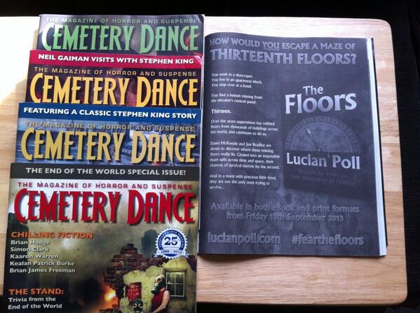
As you can see, a certain degree of vibrancy has been lost between the on-screen image and the printed copy. When you take the magazine away from direct sunlight the advert becomes rather dark indeed!
This wasn’t an isolated incident. My teaser ad for Scream turned out rather murky too, as did the initial proof copy from CreateSpace. (Never underestimate the value of a proof copy!) While these findings were a little disappointing, I’m happy to chalk them up to experience. Needless to say, subsequent artwork has seen the brightness dialled up a little more!
Overall, the discrepancy between on-screen RGB artwork and the results on paper was a valuable lesson learned, particularly for when I reboot The Forum of the Dead, as this story will contain significant graphical content.
Okay, so much for being brief! That’s all for now, folks. I hope you found these wee insights of some use, and that I won’t leave it so long before blathering again!
Laters, taters.
